DESN 232 — RAPID VIZ I | FALL 2019 | T/TH 4:00–6:45PM
2 | IMAGINARY MACHINES: ADV FORM STUDY
TIMEFRAME: 2 weeks (Summer 1 week / week 2)*
PROJECT OVERVIEW
This is a classic design sketching exercise that has been taught at schools everywhere and over many generations and is as valuable today as ever.
Often, designers may be tired of certain forms, form language, proportions, or simply need a new exercise to see things a little differently, to help break free from convention.
This project is an exercise which will open the arm up, and liberate the student's imagination to become free with line without preconceived or predetermined ideas for form or purpose. The "rules" are only that one develops their form with a full range of line weights, line qualities, and with a fully rendered tonal range.
While the book, Sketching The Basics, states that this is best done digitally, it is just as easy to work directly. It can be faster and still exceptionally well done.
YOU WILL USE A LOT OF PAPER ON THIS EXERCISE! COME PREPARED
SLOs STUDENT LEARNING OUTCOMES
- Challenge students to make choices and develop surface changes
based on core shade and rendering logic. - Challenge students to commit to strong line development.
- Challenge student's understanding and development of highly organic and complex surface changes.
- Challenge student's imagination.
GRADING & EVALUATION RUBRIC
The following Rubric applies in assessment of the student's work product, presentation, and/or process along with criteria stated in Sections 6, 7, & 8 in the Syllabus.

PROCESS: PART ONE—EXPLORATORY SKETCHING
1.1 In Class. 30 – 60 minutes. FAST & FURIOUS!!! GO!
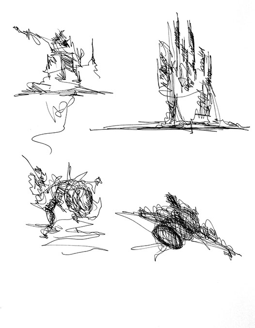
Create 70 (min) to 100 (better) doodles. You may do 1 each on 8 1/2 x 11" (Letter) Bond, or 2 each on 11x14" or 3–4 on each sheet of 14x17" Bond paper (or equivalent/similar). NO TRACE PAPER.
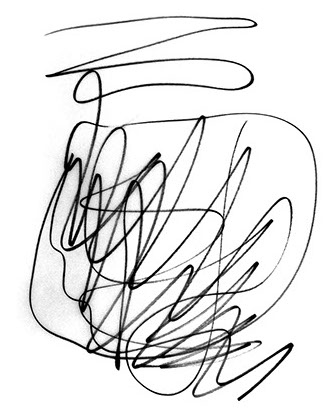
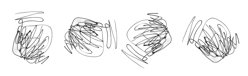
Create free, expressive, unplanned "scribble line". Do NOT over-think this process! Vary the density of your scribbles—open versus super dense; vary the intensity of your scribbles—flowing versus aggressive. There is no right or wrong scribble.
1.2 Homework. Prior to next class.
Begin to explore developing at least 5 (minimum) of your scribbles into articulated forms using ONLY graphite pencil (HB lead or softer), a monochromatic Prismacolor pencil, or pen ink. Use Cross-hatching to create shading values.
You may develop your sketches directly on the scribble, or you may use the scribble as an underlay and retrace parts of it you find interesting and want to develop further. I prefer the former, however some people prefer the latter approach. Either is fine. Figure out what works for you.
NOTE: Not every line in your scribble needs to be "used" in some way.
PROCESS: PART TWO—EMOTIVE / PERSUASIVE RENDERING
Develop and refine (ie. professionally rendered) 3 to 5 of your scribbles
into well developed conceivable forms, spaces, or objects.
NOTE: If it helps you to think of a particular kind of thing, like a restaurant lounge, bar, a camera, an appliance, then great, use that to help drive details, but it is not necessary either.
Use Markers, Pastels, Inked edges
Your finals may be on Trace Paper (interiors students only), Bond, Marker Paper (recommended), and/or Canson (recommended). You may do all 3
on the same paper, or each on a different paper in order to experiment more.
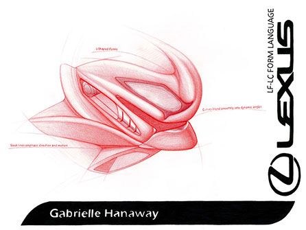
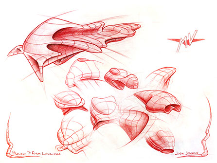
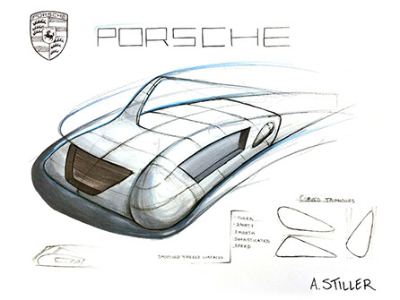
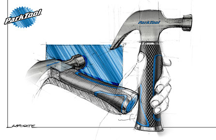
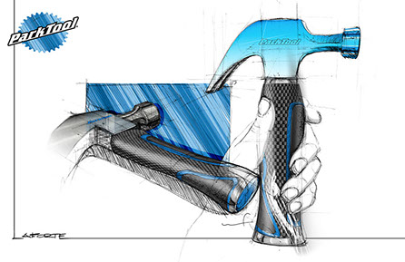
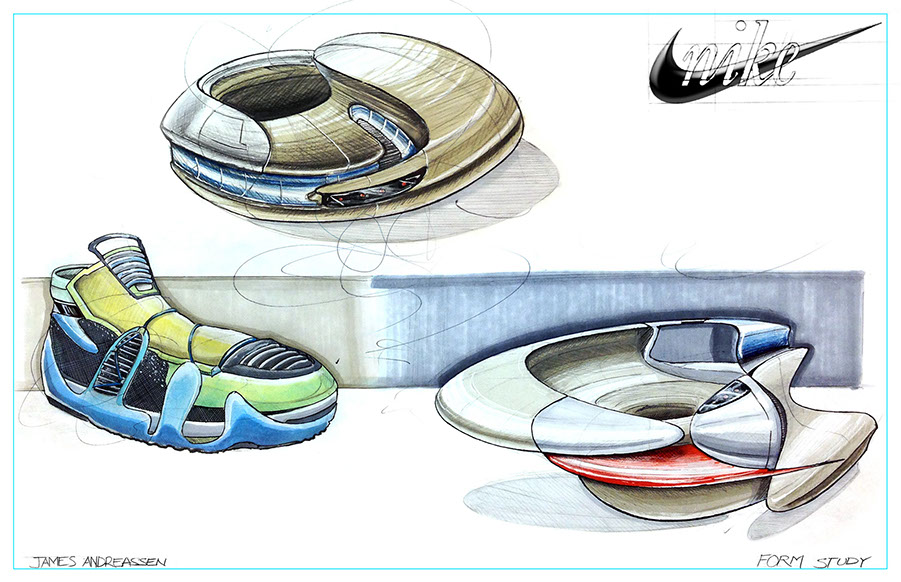
For fully developed rendering example see the pages in the book referenced above and examples below.
REFERENCES AND INSPIRATION
Sketching The Basics, Chapter 6
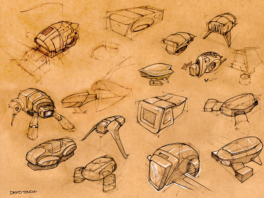
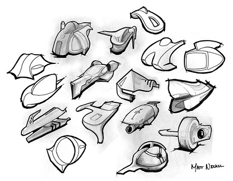
Neville Page. Award winning Hollywood creature concept artist, product designer and Art Center graduate.
Scott Robertson. Product designer, entertainment concept artist, book publisher, and Art Center graduate.
Frank Gehry. Internationally acclaimed architecture firm
Zaha Hadid. Internationally acclaimed architecture firm
Snohetta. Internationally acclaimed architecture firm
TUTORIALS & HOW-TO GUIDES
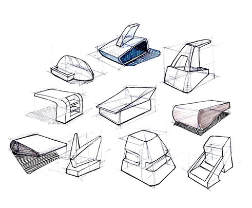
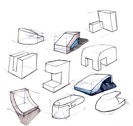
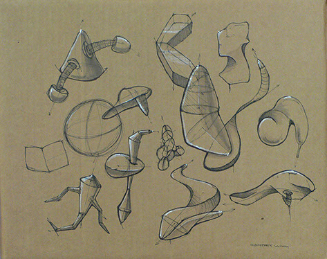
PART 1a: FORM STUDY: CONTROLLED
FORM GENERATION
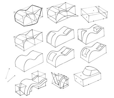
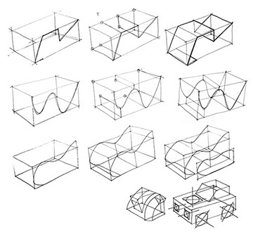
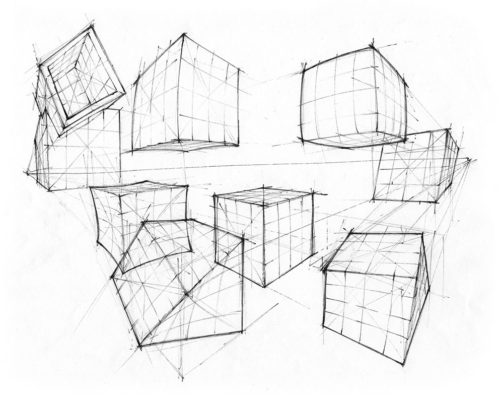
TWISTING AND WARPING
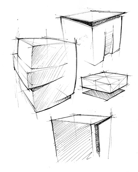
BEVELED OR CHAMFERED EDGES
LEVERAGING OPERANDS
BEVELED / CHAMFERED EDGES
ROUNDING (EDGES & CORNERS)
TWISTING AND WARPING
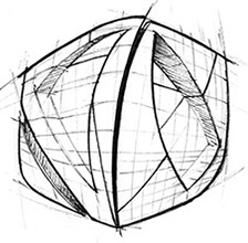
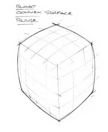
BULGING OR BLOATING
EXTRUSION
SUBTRACTION
ROUNDING
BULGING OR BLOATING
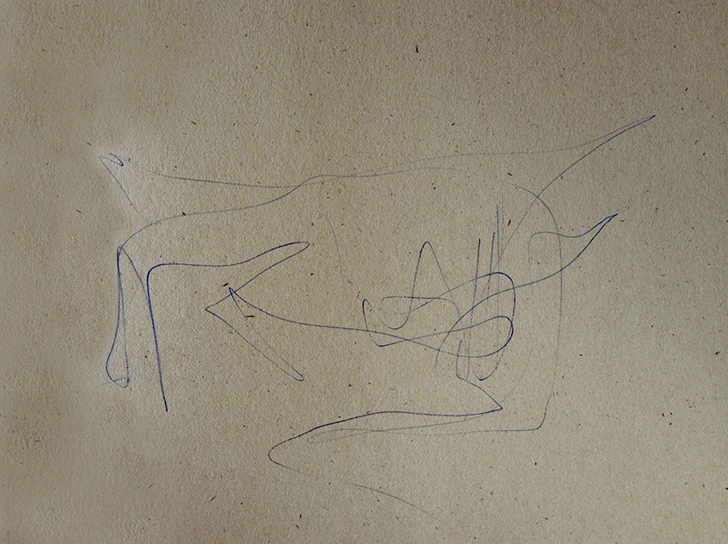


1. Random scribble doodle using Ball Point Pen on Bogus Recycled Rough
2. Begin working on the doodle. Make choices about where you "see" an opportunity to add stronger line weight or tonal value.
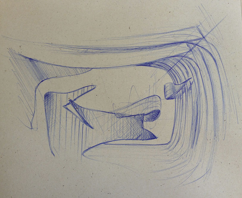
3. Keep going! Add more choices developing some strategic line weights and cross-hatching to discover surfaces. Consider simple shadows.
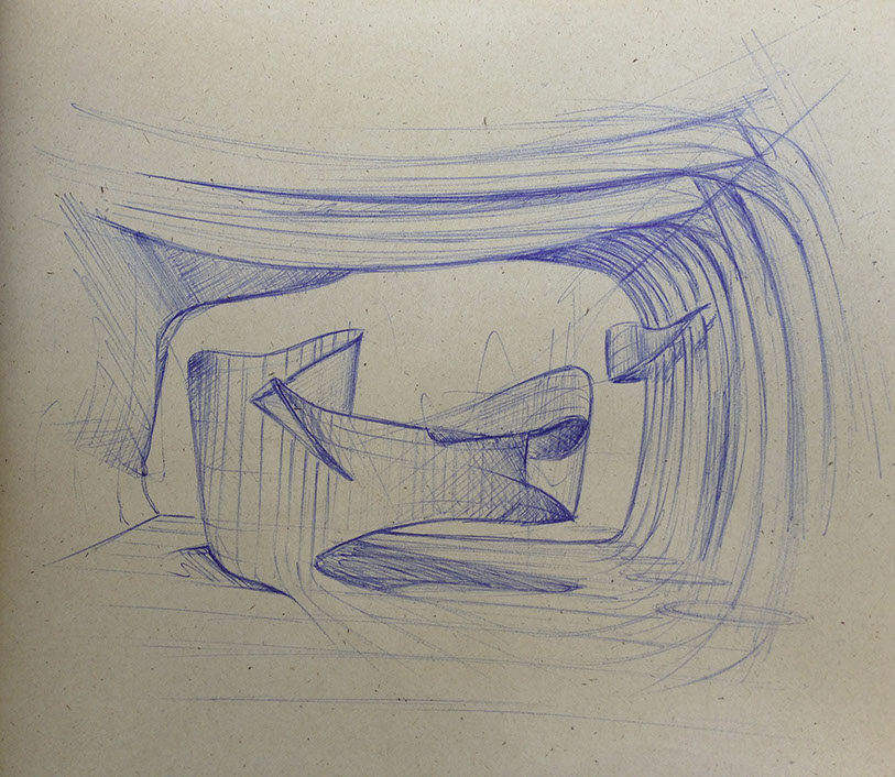
4. Keep going! Have more fun! Maybe you're thinking too hard about it. Loosen up. Rely on your knowledge of light, shading and surface changes, and line. I began adding in grey values with marker. Notice that the marker turns blue ball-point into a violet/purple; work with it and keep going.
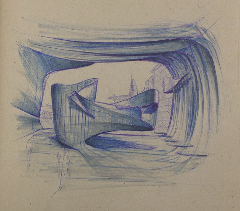
5. Add more depth using darker grey maker values and highlights with white Prismacolor pencil and white paint for extra highlights! Notice some areas that look like recessed lighting, glass, distant landscape, shadows, and reflections.
<
>
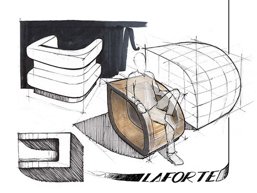
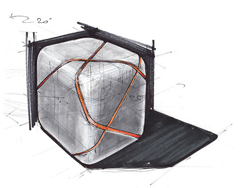
ADD HUMAN SCALE AND RENDER MATERIALITY
People added into this sketch using Photoshop.
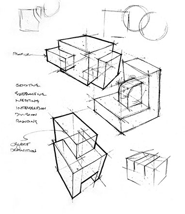
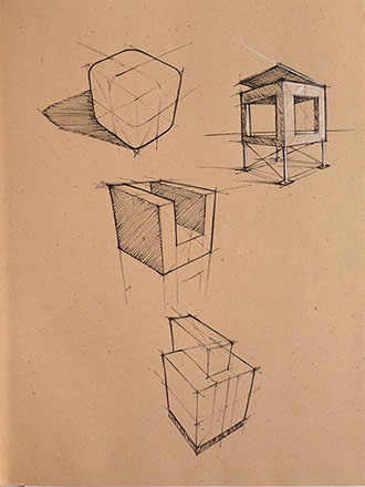
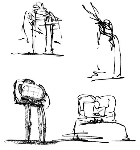
PROCESS
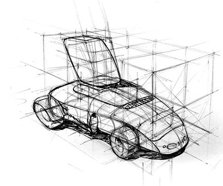
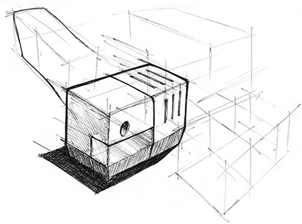
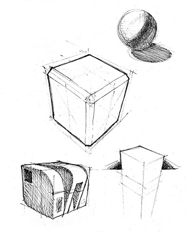
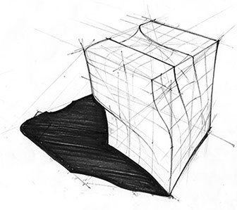
Start with a block, or two.
Add more blocks, cylinders, etc. to "assemble" form.
Modify edges with bevels
or rounding.
Describe surface changes with parting or contour lines.
Impart a sense of scale.
Render with markers.
Finalize line weights.
PART 1b: ADVANCED FORM STUDY—FREE ASSOCIATIVE FORM IDEATION
INTERIOR EXAMPLE
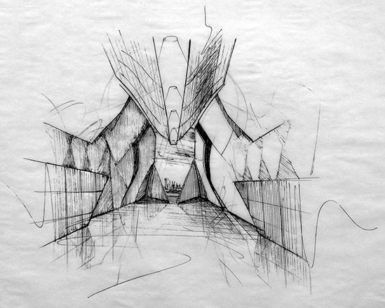
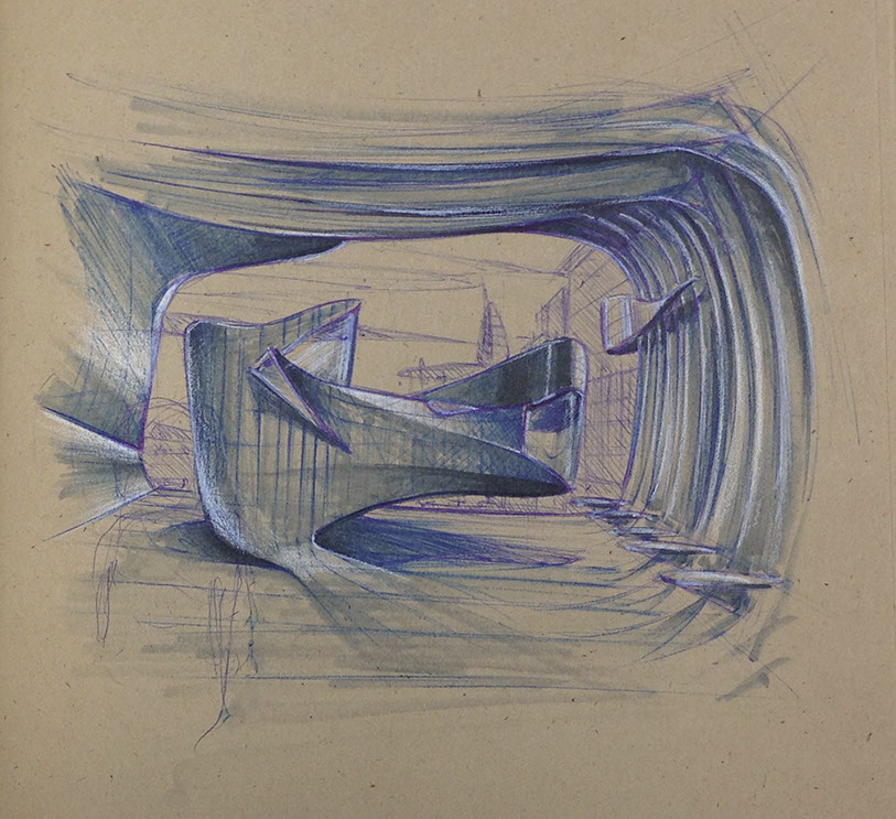
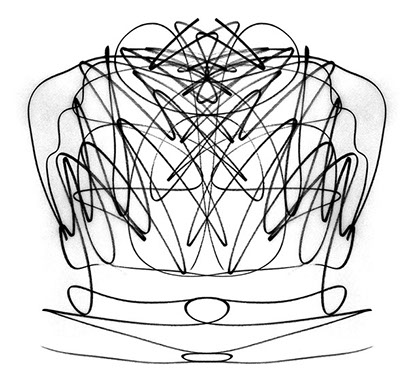
A student created this scribble (right) which I then rotated vertically, traced a mirror of it and then began seeing a large space which I developed into this grand interior space. Ink pen.
OBJECT EXAMPLE
Simply spinning the scribble around will reveal something all together different or lead me down a different path and perhaps one would've been more inspired that the effort above.
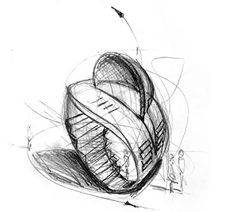
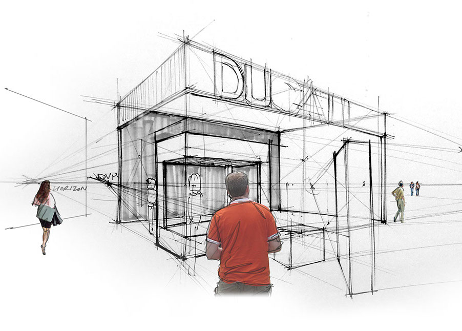
This scribble began with a graphite line and went from a small object to a small pavilion by simply adding rough people for scale.
Sometimes you get going and begin rendering, only to feel like it's a dog and not going anywhere. That's ok, abandon it and move on to another one, or try the same doodle again, spin it around, flip it upside down, mirror it, trace different lines, etc. You can always retrace and flip your underlay over to get symmetrical forms. Again, a limitless variety can come from this approach.
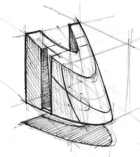
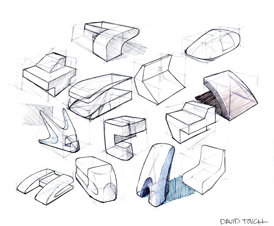
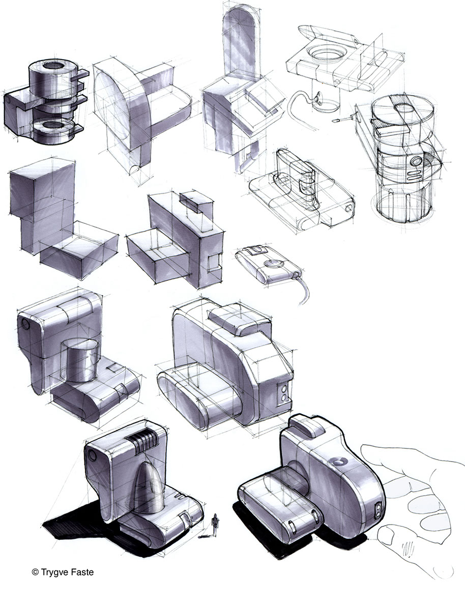
A simple form which may be a coffee grinder emerged from the scribble on bottom left, which a headlight study was derived out of the scribble at the bottom right. Try to avoid creating characters (top row) in this study unless your major is character or creature design. Think object or space.
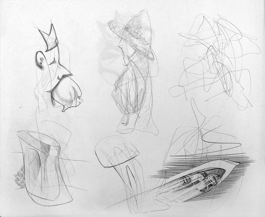
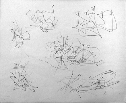
On this sheet of scribbles the lower left has been developed further. Initial doodles done with a felt tip pen while the detailing added to the developed sketch used technical ink.
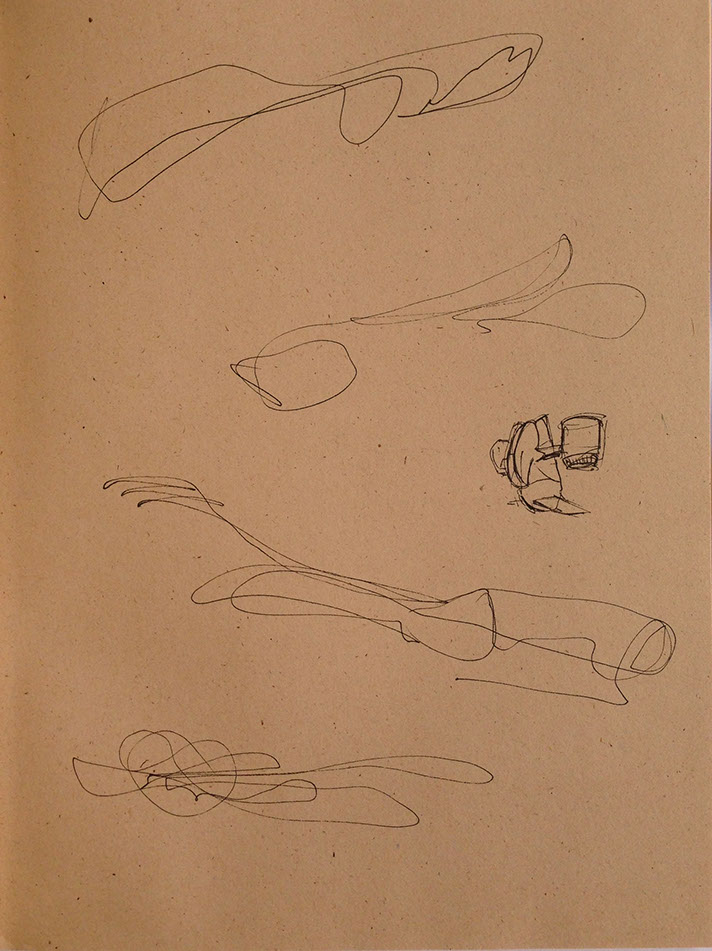
A sheet of scribbles undeveloped from my sketchbooks.
Use Toned Paper. This sheet of scribbles is undeveloped on brown recycled sketchbook. With some effort and imagination,
any of these can be made into something engaging using line, crosshatching, and application of values and perspective logic.
The designer's sketches below were on several sheets of buff brown stock, combined in Photoshop to appear seamless while retaining the paper character.

An example of using animal forms in early ideation to generate speed forms. Technique includes dusting with pastels. Designer unkown.

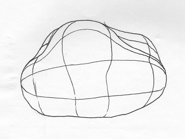
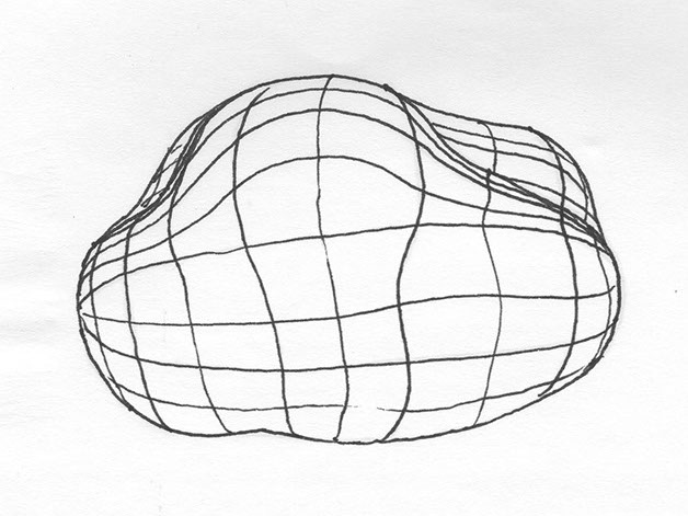
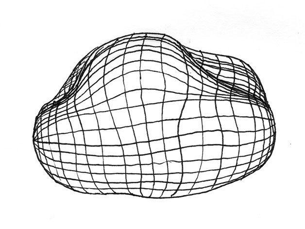
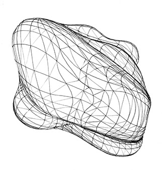
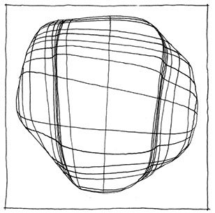
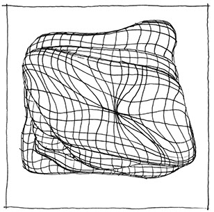
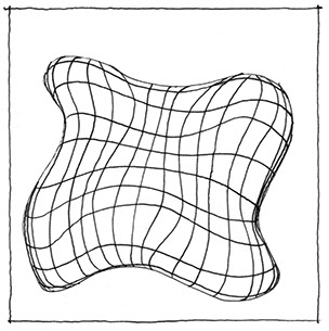
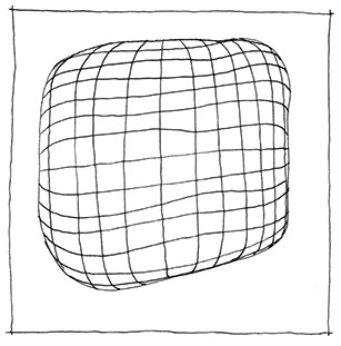
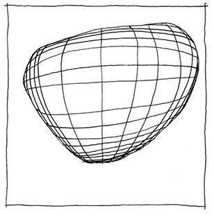
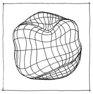
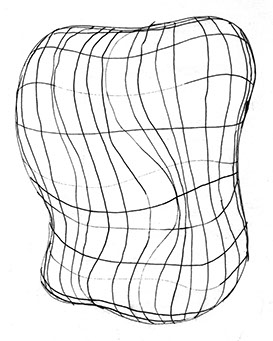
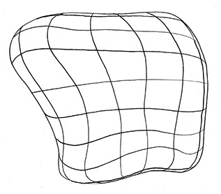
Meshwork Contouring Exercise
Often times students new to this process have a difficult time finding forms in their scribbles. Try this exercise. I have hundreds of these littered throughout my sketchbooks. They provide a relaxing way to unwind and not feel pressured to design anything in particular. I find them to be somewhat meditative.
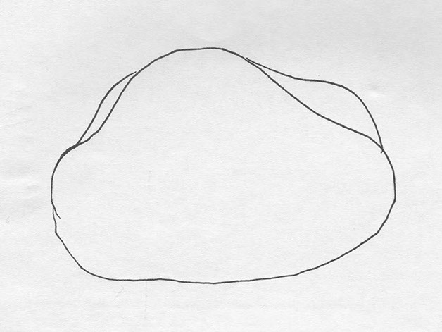
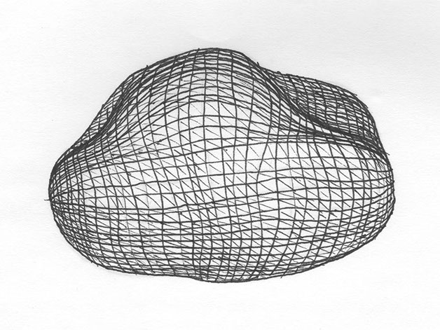
Profile. Create a random shape, like a lumpy potato is fine. Keep it simple to begin with. Be sure to close up your shape.
Contour. Add a "vertical" contour line, preferably "warping" it some to add more surface deformation. Be sure to bend the contour as it near the profile of the form. Add a couple more contours, somewhere between the first one you set and the profile. Be sure to bend the line more as it approaches the profile of the form; effectively "rounding" as the contour rolls around or under the form.
Subdivide. Add more lines in-between lines. Work horizontally as well as vertically. Set lines increasingly closer together as they approach the profile, just like on cylinders and spheres.
Increased Poly Count. Increase the "resolution" or polygon count of your mesh by subdividing further.
Triangulation. You can even triangulate your "squares" to approximate even further what happens in advanced 3D modeling programs. This isn't necessary, but can be fun.
<
>
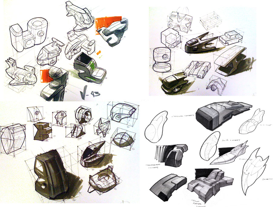
Below are some examples from my sketchbooks
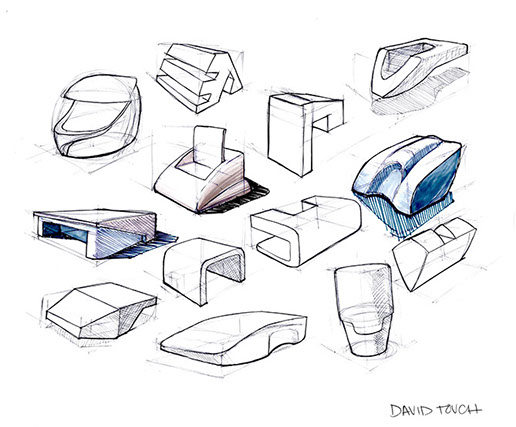
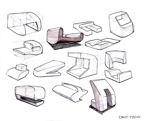
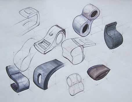
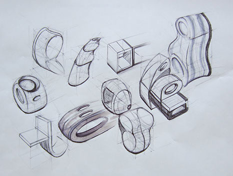
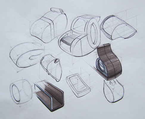
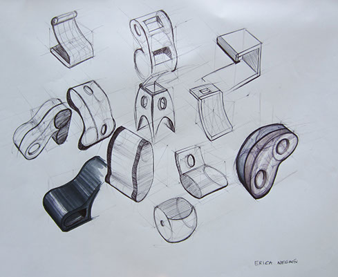
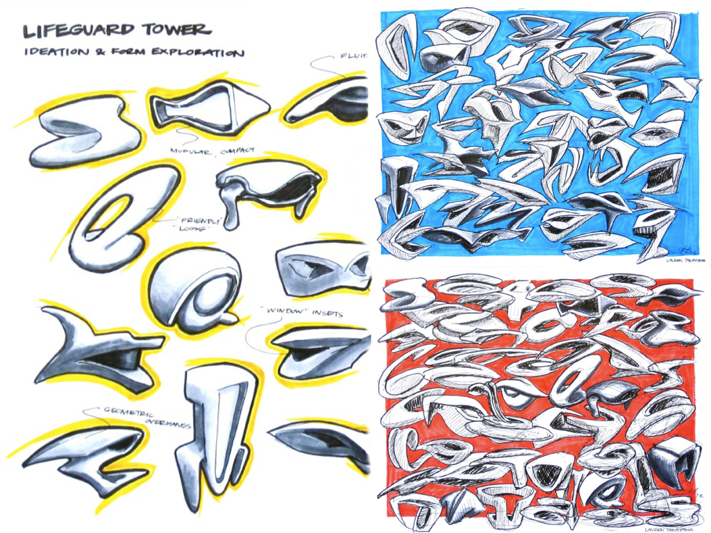
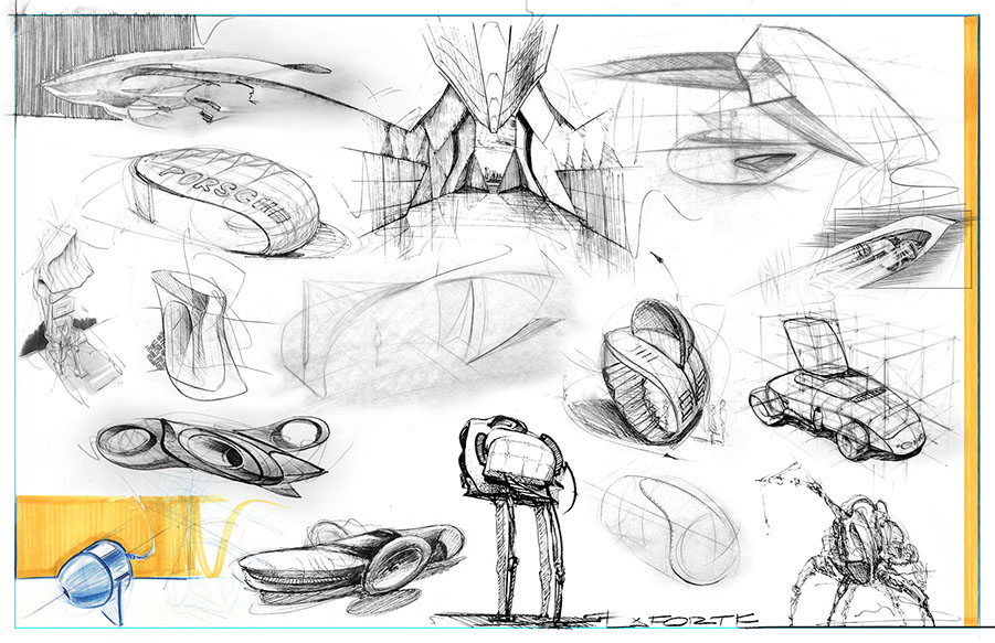
PART 2: REFINED CHOICES, REFINED LINE
Bring together between 10 (min) to 15 (better) of your sketches onto one sheet. You may do this using traditional sketching entirely, or you may opt for using Photoshop (or another comparable image editing program).
Below is an example of 16 sketches (some shown above) originally created in a variety of media including blue pencil, red pencil, ink, graphite, etc., brought together into a single ideation sheet for presentation on 11x17" paper.
A cyan-colored line shows the 16.5x10.5" image area, printable area. Remember, most laser printers will not print all the way to the edge of the paper, so plan accordingly and control your margins.
Be sure to include your name on the sheet!
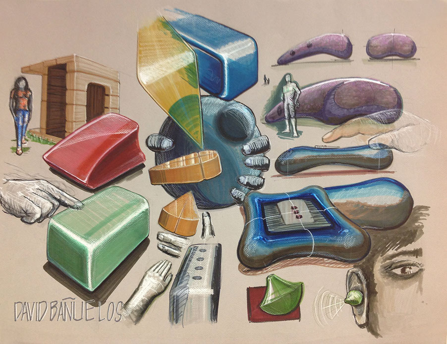
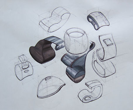
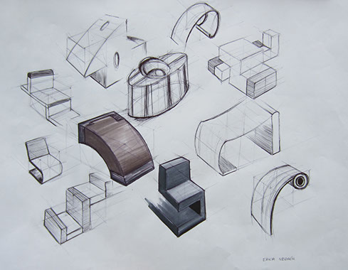
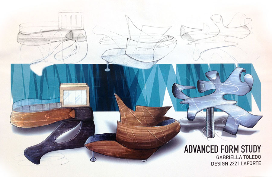
PART 3: "BRAND" YOUR PRESENTATION OF FORM(S)
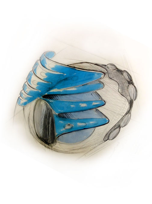
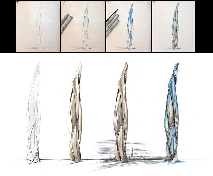
Finalize your FINAL 3 Selection into a "Branded" Presentation on 1 or 2 sheets, depending on the size of your drawings as necessary. You may work in traditional media or digitally, or a combination of both, Photoshop is highly recommended for pulling your sketches and renderings together.
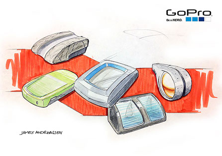
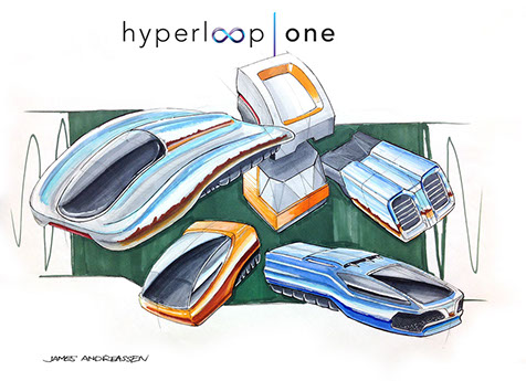
One of the big advantages of Photoshop (or similar digital apps) is that once you're work is underway, you can explore different materials easily, such as a brushed stainless steel head (below left) versus and anodized finish (below right). With practice, like sketching, you'll get faster and develop your own arsenal of tricks.
The cyan line is shown in the layout below is not for printing, but to show the safe printer margin limits. Be conscious of your printer's margins and control the margins so they look even all around. Be sure that critical information won't get cut-off. It's very important to be conscious of this when you're designing your layout.
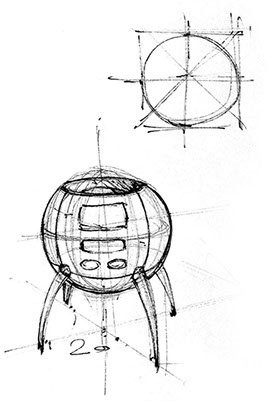
BE SURE TO PRESERVE YOUR ORIGINAL SCRIBBLE (BELOW) AND/OR BOUNDING PERSPECTIVE BOXES (EXAMPLES ABOVE), THROUGH TO THE FINAL.
^
* Estimate only. See instructor and calendar for specific due dates. Summer Session schedule is more compressed with one week equal to approximately two and half semester weeks.
CSULB | COTA | DEPARTMENT OF DESIGN | BIO

Questions, feedback, suggestions?
Email me with your recommendations.
©2020 Michael LaForte / Studio LaForte, All Rights Reserved. This site and all work shown here is purely for educational purposes only. Where ever possible student work has been used or original works by Michael LaForte.
Works by professionals found online or in publication are used as instructional aids in student understanding and growth and is credited everywhere possible.