DESN 255 — INTRO TO COMPUTER GRAPHICS I | FALL 2020 | TTH 1:00–3:45PM | ONLINE (AMI)
LOGO DESIGN
Logo comes from the Greek concept of Logos, one of the three rhetorical appeals—along with ethos and pathos—ie. modes of persuasion, defined by Aristotle to explain how rhetoric works. Logos is the appeal to logic to persuade and audience using facts and figures [and icons].1
------------
Presence is implicit in Western philosophy’s reliance on reason, which distinguishes sharply between what is present (now, here) and what is absent (past or future, somewhere else), and searches for a pure origin and secure ground for thought, summed up in the Greek word logos—hence Derrida’s name for this way of thinking, logocentrism. If presence is fundamental and inalienable, anything that threatens to complicate or sully it must be regarded as secondary, derivative and regrettable. For presence is a value; it is what is proper, proper to meaning, to consciousness, to existence, but also good and correct (the French propre carries a suggestion of cleanliness and purity). Derrida defines the “metaphysics of presence” as “the enterprise of returning ‘strategically’, ‘ideally’, to an origin or to a priority thought to be simple, intact, normal, pure, standard, self-identical, in order then to think in terms of derivation, complication, deterioration, accident, etc.2
2. Jacques Derrida: The problems of presence, by Derek Attridge explores différance, deconstruction and the role of the impossible in the work of the divisive philosopher
OVERVIEW
DESIGN a unique new logo identity for a client, to be introduced in class.
A logo is not just a “mark”. A logo reflects a business or organization's commercial brand via the use of shape, fonts, color, and/or images.
A logo is for inspiring trust, recognition, admiration, or any number of other qualities for a company, product, service, or organization. It is our job as designers to create a logo that can do this job as effectively as possible.
In the end, it’s the client’s role to implement it for their needs.
Read all the accompanying supplemental links bel ow to have the greatest success on this project.
DELIVERABLES
Depending on the client and any unique requirements they may have put forth, however in most cases we will present our designs on a single 11x17", landscape printout and PDF file for submission.
Submit the same PDF file of your design to Dropbox.com.
Include your name in your filename, but not on the layout, in the event it is an anonymous award competition.
Designs must include the logo represented in various forms:
- Large 4-6”
- Favicon. The thumbnail sized icon appearing in URL addresses. In print, 1/4" will emulate this well.
- Black/white and 3 single color versions
- A 2 or 3 color variation (max) and/or multicolor version
- Stand alone logo
- Logo with lockup with clear-space specifications
- Logo lockup and tagline
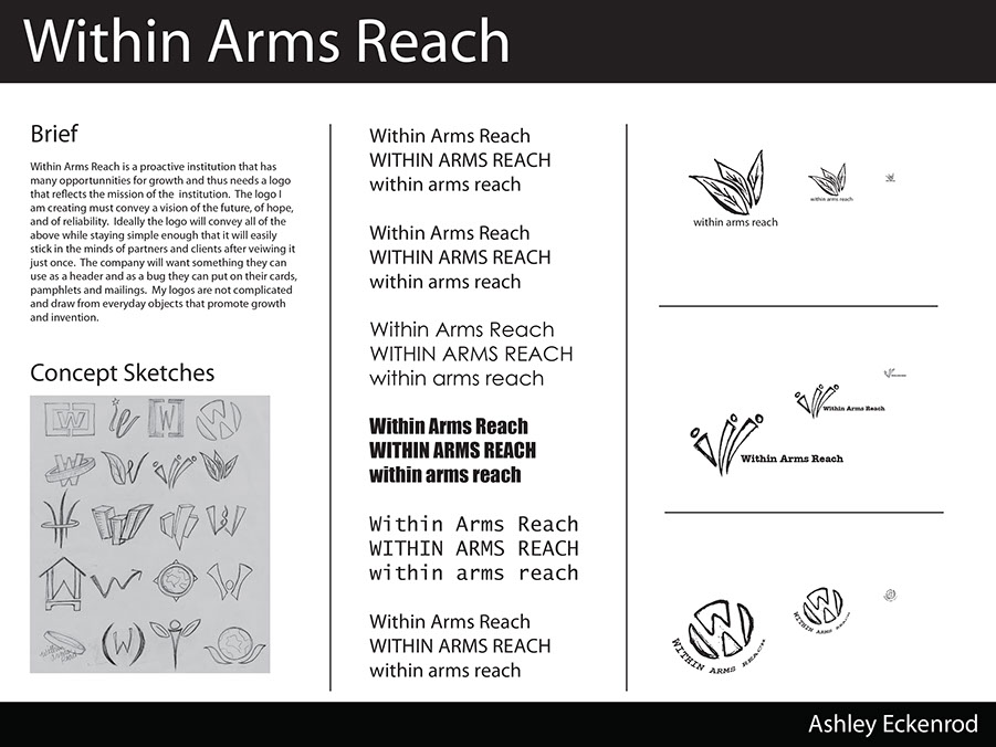
- A brief 50-100 word statement of explanation of design concept
- Appropriate identifying headings for the above stated elements
PHASE 1. IDEATION
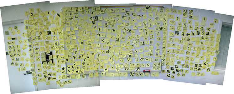
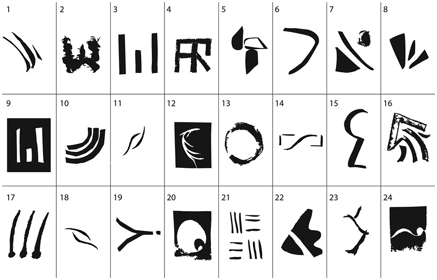
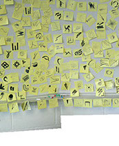
Explore lots of variation through sketches first, before jumping into Illustrator. Sometimes you will have to generate a lot of ideas on your own, or sometimes you might work collaboratively and your whole team can have brainstorming sessions using nothing more than post-it notes. When working, allow yourself to free associate and draw anything and everything that pops into your mind. Don't edit. You can edit your ideas out later.
Sketching with a pencil is fine, but be sure to firm up the figure/ground contrast using a Sharpie, Papermate Flair or a technical pen.
Avoid too much ultra-fine details that will never be visible when scaled down. The ability to zoom in on the computer can give you a false sense of what will hold up when printed small.
Watch this video by Aaron Draplin << MANDATORY!
PHASE 2. DESIGN REFINEMENT
Using Photoshop and/or Illustrator, clean up your paths and explore color variations as well as begin setting up type choices for the brand identity. Feel free to continue your creative exploration in Illustrator coming up with other options you might want to consider.
At this point you should also be leaning toward a few directions you feel are strongest, so start refining by looking at the figure/ground relationships, pattern, etc.
PHASE 3. PRESENTATION
Depending on who your client is and any parameters they've requested, generally you'll want to show your client anywhere from 3-5 design directions—any less and it'll look like you are too set in your direction and any more and the client won't be able to commit to a direction.
At a first round meeting you may want to present only black and white graphic solutions or possibly color combinations you feel most strongly reinforce the organization's goals. If the organization already has specific colors, it's important to get this information at the start of the project, rather than waste time proposing irrelevant colors.
Example:
ADDITIONAL REFERENCES
Mastering Logo Design in Adobe Illustrator - 1:29:00
How to design a Logo - Full Identity Design Course - 2:52:00
Pricing Design Work & Creativity - The Futur
How to design a logo with the Golden Ration - Illustrator Tutorial
Design ProcessCreative NerdsMarket StormDavid Airey / ProcessJust Creative / Process start to finishThe Design Cubicle / Steps of a Successful Logo Design ProcessThe Secret Life of LogosThe Logo Factory / logo design tips Graphic Design OrganizationsThe American Institute of Graphic ArtsThe Art Director’s GuildThe Society of Environmental Graphic DesignOC Ad FedDesigners and DiscourseDesign ObserverLogo Lounge / Yearly TrendsPentagram / Michael Beirut, Paula Scher, et alApril GreimanBruce Mau DesignStefan SagmeisterSaul BassRick Poynor / Raygun MagazineChermeyoff & GeismarAaron DraplinSamples of BAD logo designsBad, ugly, and worst logo designs
 A QUESTIONAIRE TO HELP BETTER UNDERSTAND YOUR CLIENTWHAT IS A GOOD LOGO DESIGN?TYPOGRAPHY BASICSA GUIDE TO BAD LOGO DESIGNSLOGO DESIGN PROCESSLOGO DESIGN RELATED TOPICS
TUTORIALS & HOW-TO GUIDES
STUDENT LEARNING OUTCOMES
Upon completing this assignment students will have gained a high degree of exposure to Adobe Illustrator and gain confidence in using Illustrator for creating professional vector graphic artwork.
- Students will gain experience with layers and layer management,
- Students will gain understanding on how to manipulate color and color values of objects and elements,
- Students will gain an understanding of how to manipulate shapes,
- Students will gain an understanding on how to modify the document setup area as needed,
- Students will gain understanding of different color modes,
^
* Estimate only. See instructor and calendar for specific due dates. Summer Session schedule is more compressed with one week equal to approximately two and half semester weeks.
CSULB | COTA | DEPARTMENT OF DESIGN | BIO

Questions, feedback, suggestions?
Email me with your recommendations.
©2020 Michael LaForte / Studio LaForte, All Rights Reserved. This site and all work shown here is purely for educational purposes only. Where ever possible student work has been used or original works by Michael LaForte.
Works by professionals found online or in publication are used as instructional aids in student understanding and growth and is credited everywhere possible.