DESN 255 — INTRO TO COMPUTER GRAPHICS I | FALL 2020 | TTH 1:00–3:45PM | ONLINE (AMI)
INTERIOR DESIGN RENDERING IN PHOTOSHOP
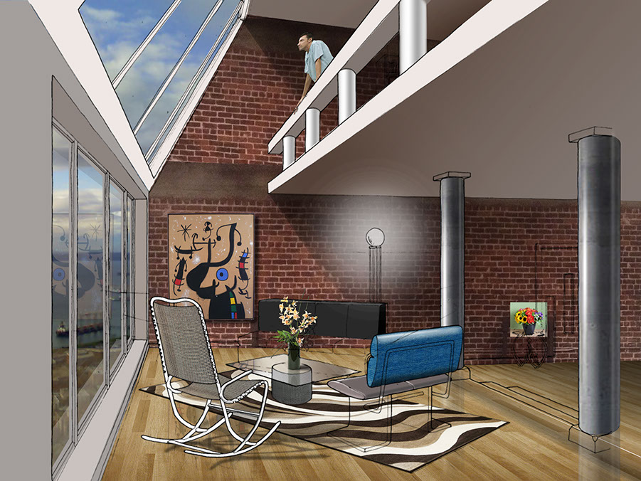
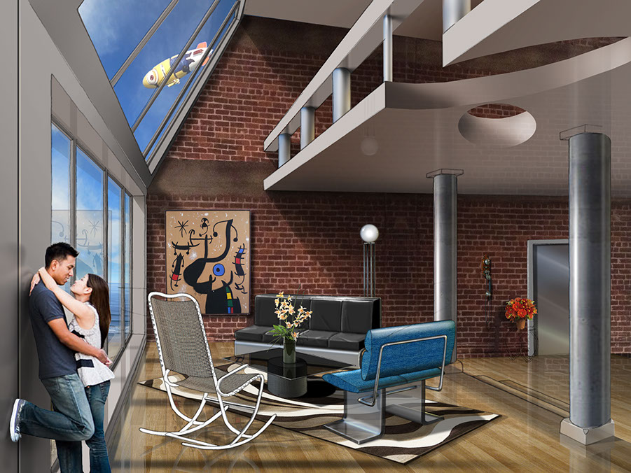
GO FROM THIS --------------------------> TO THIS!
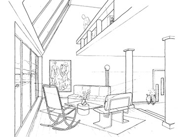
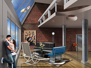
Estimated Time: 20 hours or 2 working days
GET STARTED: THE DRAWING CLEANUP AND PREPARATION
FIRST!! This is NOT difficult and no special tricks were used. 90% of it is Layers, Multiply Layer Blending mode, and Levels, REALLY!
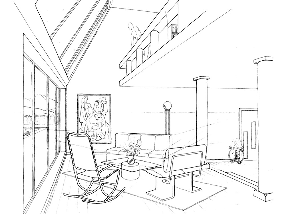
This original multi-point perspective drawing of an architectural interior was done in technical ink, so it was very easy to get a clean white background and keep the line work crisp black using Levels.
Your image may need to be rotated and/or cropped and Levels adjusted to get the paper to white or near white.
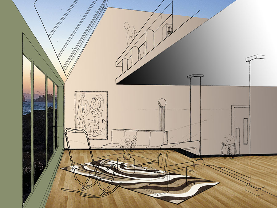
STEP 2: BLOCKING OUT MAJOR SURFACES
Your original drawing will usually be on a layer called Background. Duplicate the background layer and begin building layers below this Background Copy. Turn the layer blending mode of Background Copy to Multiply, allowing colors of layers below to be seen through the white.
Note, if you didn't start with good artwork to begin with or didn't clean it up with Levels and your background look dingy and grey, it will have a muddy affect on your colors in layers below the Background Copy layer, ie your sketch/drawing. Start with clean work.
STEP 3: DEVELOP SPECIFIC PIECES
As you work, allow yourself to design as you go. Respond to choices you've made. Feel free to darken the hardwood floor you put in, play around with the colors on a piece of furniture using Hue & Saturation.
Use the Transform > Distort function to put things into correct perspective, DO NOT RELY on the the Perspective tool.
Use the Transform > Warp function to make textures and fabrics feel like
they belong to particular curved surface, such as in the rocking chair and
blue denim sofa below.
Remember there's life outside the windows. Take a photograph from your site, or feel free to place your space in the environment of your choice. Be sure the perspective makes sense! Be sure to adjust the Levels and/or Hue & Saturation for Atmospheric Perspective. Consider applying a gradient white layer with about 20-30% opacity.
Think about your dominant light source and any secondary and tertiary
light sources. Build in shadows and warm light and cool light values correspondingly.
Consider polished surfaces and the degree to which they are reflective and add in reflections and consider transparencies.
STEP 4: FINISHING
Include People and plants, push in on extra highlights, step back and see what looks flat and needs more development. Maybe the forms still need highlights and core shade values, or three-plane contrast logic.
Always consider Foreground, Middle Space, and Far Distances. Allow distant landscape and objects to be a little softer and out of focus, and desaturate colors some. Foreground should be the focal point.
I like to keep the original drawing or sketch layer visible, but softened. You can do this by reducing the opacity some, to 60-70%. Seeing the original sketch softens the digital work, making it feel more alive and human.
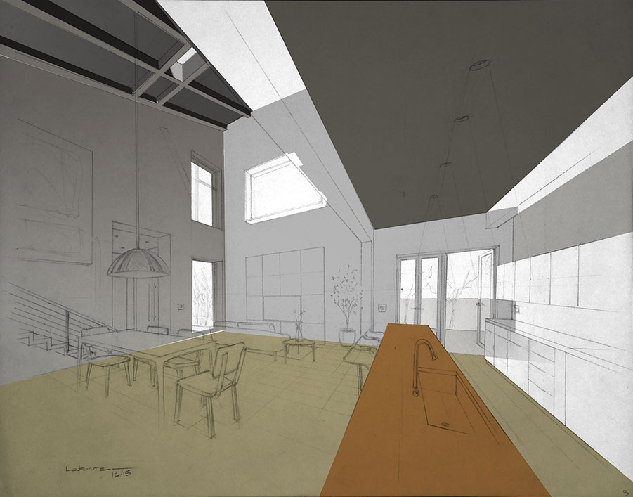
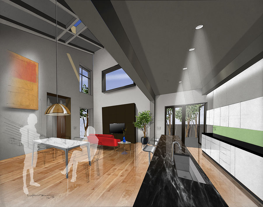
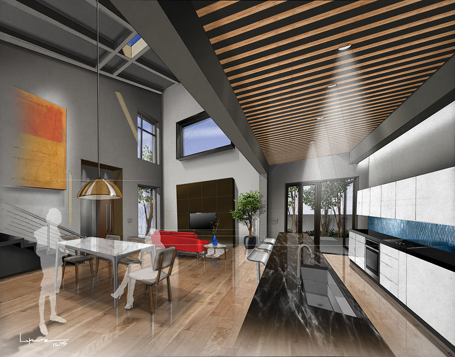
EXAMPLE 2
GO FROM THIS --------------------------> TO THIS!


Estimated Time: 24 hours or 2-3 working days
FIRST!! This is NOT difficult and no special tricks were used. 90% of it is Layers, Multiply Layer Blending mode, and Levels, REALLY!
MYTH: MANY PEOPLE BELIEVE DIGITAL SKETCHING/RENDERING IS FASTER THAN TRADITIONAL, IT IS NOT. THE MARKER RENDERING BELOW TOOK JUST ABOUT 2 HOURS, WHERE THE DIGITAL TOOK 10X AS LONG. DIGITAL DOES ALLOW YOU TO MAKE CHANGES TO YOUR DESIGN MORE EASILY. EACH HAS IT'S OWN CHARACTER AND PLACE IN THE DESIGN PROCESS.
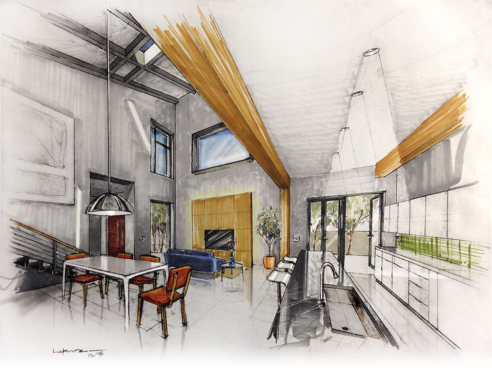
Marker rendering on Bond. You do not need to try to copy this design look. Develop your own "interpretation" or design for the space.
GET STARTED: THE DRAWING CLEANUP AND PREPARATION
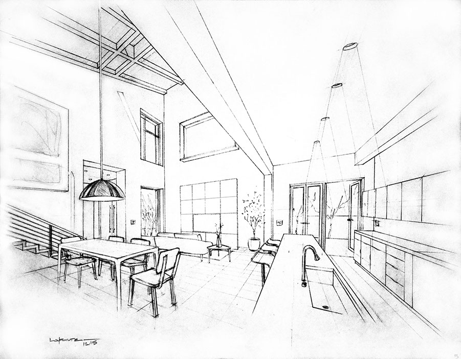
The first problem you often face is your photographed image is upside down, and has some background that needs to get trimmed out.
1. Use the PERSPECTIVE CROP tool
2. To flip the image over Go to Menu > Rotate Canvas > 180 degrees (or 90 clockwise or counterclockwise as needed).

Sketch by Michael LaForte. You MUST credit LaForte with the original sketch on your final rendering.
This original multi-point perspective drawing of an architectural interior was done in technical ink, so it was very easy to get a clean white background and keep the line work crisp black using Levels.
3. Levels. Adjust the White of the paper to get as close to white as you can, without losing too much of the sketch. Black ink drawings will work best! Below. What the sketch should look like when properly adjusted before rendering.
4. Duplicate Your Original Sketch Layer
5. Set this Sketch Layer to Blending Mode Multiply
6. Build your planes on layers BELOW the Sketch Layer. Use the Polygonal Lasso to select an area (new layer) then fill that selection with a color. You can always change the color later using Hue & Saturation (cmd/ctrl + U), so early on, don't worry about the exact material or color. We can change it!
7. Add Sky and Landscaping in Layers Below the Wall and/or Ceiling Planes.
8. Remember to create a Layer and/or Group for each "object", such as the lamp, sofa, etc. As you start to add Highlights and Core Shade to the object, You can keep them all together in groups.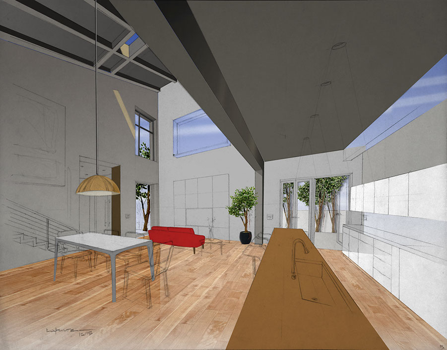
9. Add Lighting. Polygon lasso, draw a triangular shape. Fill with White. Blur > Gausian Blur to soften the edges
10. Use Transform > Distort to ADD Artwork, Cabinetry, Backsplashes, Countertops with real Material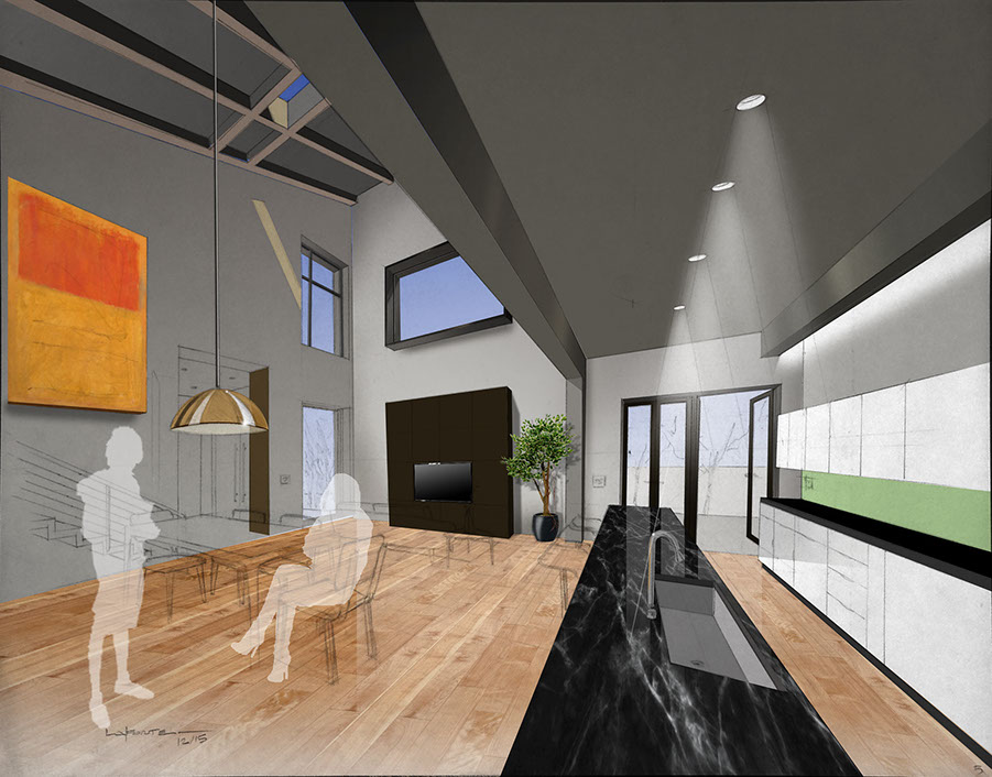
11. Keep going! Add more furniture, Details, HIghlights for modeling
NOTE: DON'T SIMPLY COPY AND PASTE A SOFA FROM THE WEB INTO YOUR SKETCH. PAINT IN YOUR FURNITURE. PASTED IN ELEMENTS ALWAYS LOOK FAKE AS THEY ARE NEVER IN THE RIGHT PERSPECTIVE.
12. Add People Silhouettes and plants. Google Search People Entourage. Remember to add shadows to the walls and floor based on light sources.
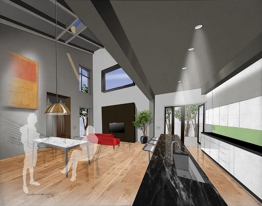
13. The DEPTH of your rendering will depend on the depth of your understanding of Light Logic, Shade & Shadows, and Reflections. Add more of these ambient effects and shadows. Note the Layer ordering. I have my Table/Chairs on a layer above the Shadow, and those are above the Floor layer.
Look at the VALUE (the Lightness or Darkness) of a Surface, such as the TV console, below, it's dark, so carry that darkness into the floor. Use a Soft Edge Eraser to create the Fade off, Use Layer Opacity ~50% to make it blend into the floor. Do the same with Light Elements, such as Windows and Doors or White Cabinetry.
14. Final Lens Flare Effects are done in a very simple method, a white paint streak.
15. Put ALL Strongest Highlights on layers ABOVE the Sketch to make them POP! Any slight dirtiness in the sketch can dull down the glare shines, and you also want these to be over your line work.
TUTORIALS & HOW-TO GUIDES
< BIG JUMP HERE, I KNOW
RESIDENTIAL DESIGN CASE STUDIES
Photoshop can be used to create pre-viz concept images when you don't have time or resources for
full 3D modeling. Below are a few Before and After examples.
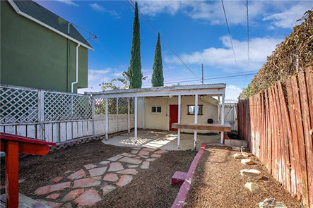
EXISTING
VISUALIZATION
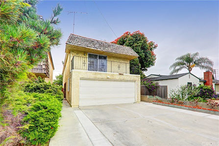
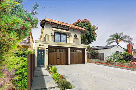
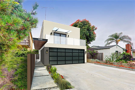
Maybe your client would like to see what an addition might look like above the alley accessed garage.
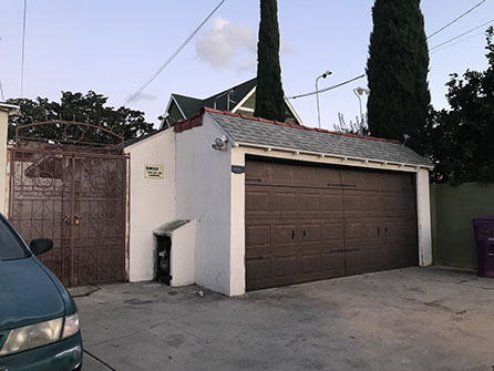
EXISTING
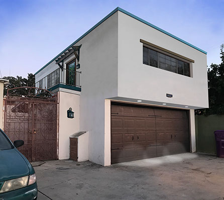
Alley view above. Garden view below.
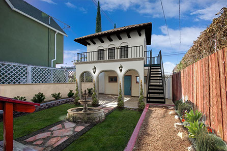
SPANISH COLONIAL / MEDITERRANEAN
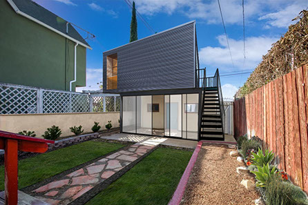
CONTEMPORARY INDUSTRIAL
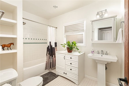
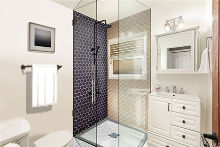
I like to develop both interior and exterior views for my clients, so we can look at how the design execution throughout. Below, we looked at making a master bath from the generously sized single bath by inserting a wall where the tub edge is. The tub plumbing will then become a master bath on the other side of the wall.
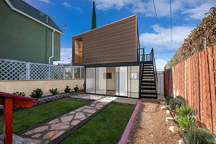
CONTEMPORARY INDUSTRIAL, RUSTED
EXISTING
VISUALIZATION
MEDITERRANEAN
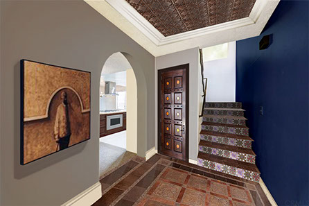
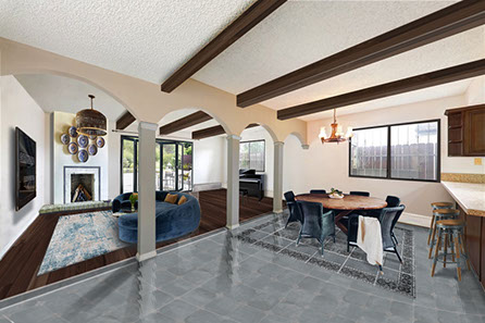
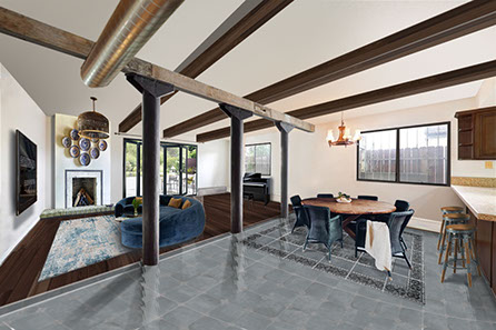
Developing both interior and exterior views for my clients, allows us to consider how the design language carries throughout. Below, we redesigned the foyer for a more grand presence and create definition between the main living space, dining areas, and kitchen.
CONTEMPORARY MODERN
STUDENT EXAMPLES
Take a close look at these student examples as they've also "captured" the development process stages.
SAMPLE TO DOWNLOAD
Sketch by Michael LaForte. You MUST credit LaForte with the original sketch on your final rendering.

^
STEP 3: "BUILD" YOUR RENDERING USING LAYERS!
While some are designers paint using just one layer for their concept images, most of us will want to work with layers which allow us to build up the image.
Layer Management - Group Your Layers
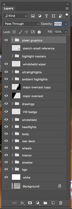
Hold Shift key or CMD key and select the layers you want to group, then select the little folder icon at the bottom of the palette. Be sure to change the name of the group from Group 1 to something more meaningful.
A few Layer Groups from this rendering. I use abbreviations as much as possible, such as BG or BGS for Backgrounds, below left.
Create sub-groups, groups within groups,
as well if needed. It's your image, do what you need to to help you be productive.
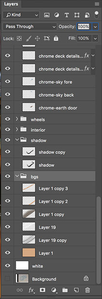
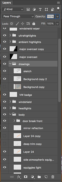
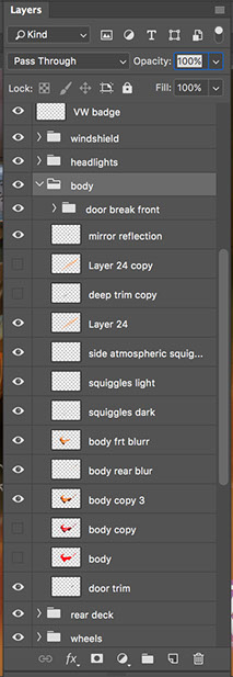
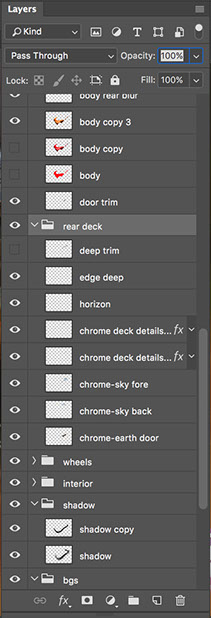
Your final rendering will have many layers and layer groups to help manage and organize the layers.
A trick: I often re-use artifacts left over from erasing and painting and use them elsewhere in the rendering; Copy or Duplicate the layer, Rotate, Move, etc., creating more life and dimension throughout the rendering.
Layer Blending Modes. Explore the various options and the effect they have. While I use a few quite a lot, many others can create some really great unexpected results. Play around. You may discover opportunities that look great and you didn't previously envision.
* Estimate only. See instructor and calendar for specific due dates. Summer Session schedule is more compressed with one week equal to approximately two and half semester weeks.
CSULB | COTA | DEPARTMENT OF DESIGN | BIO

Questions, feedback, suggestions?
Email me with your recommendations.
©2020 Michael LaForte / Studio LaForte, All Rights Reserved. This site and all work shown here is purely for educational purposes only. Where ever possible student work has been used or original works by Michael LaForte.
Works by professionals found online or in publication are used as instructional aids in student understanding and growth and is credited everywhere possible.