DESN 255 — INTRO TO COMPUTER GRAPHICS I | FALL 2020 | TTH 1:00–3:45PM | ONLINE (AMI)
INDESIGN: BRANDING STANDARDS MANUAL
BRIEF
How to brands maintain a consistent image to their customers? From color choices, variations of applications, and so on, there's a million places to get it wrong. A Branding Standards Manual helps everyone to stay on the same page.
Today, for businesses to succeed, they need to effectively manage their image. To do this, designers need to provide their clients with a design Guidelines Manual, which communicates to others across the chain and over time some rules, do's and don'ts of usage to maintain and uphold the design language as it gets applied to any number of items the business may eventually need.
Take a close look at your favorite brands, from custom automotive wheel makers like American Racing to athletic companies like Starbucks, Apple Computer, Target, VW, Under Armour, Roxy, Oakley, Fizik, even our university, what you don't see, which ties their branded look together is a Brand Standards Guide. When done well, there are very strict controls and parameters in place. We often directly associate this with corporate logos, but it extends to color specifics, usage, signage applications, and may even go so far as to establish architectural guidelines, especially in highly planned communities such as those by the Irvine Corporation, retail mall developments, and so forth.Depending on the depth and scope of the business entity, some may be as little as 10 pages while others are as massive as 10 volumes.
For this assignment Students will find a small local business to use as a case study to design, create, and establish a Brand Standards Guideline BOOK that will be the thread that unifies the semester's content created in Illustrator, Photoshop, and InDesign.
Your Brand Standards Guide will include:
- The Book (InDesign and Acrobat)
- Logo (Illustrator)
- Product or Interior Design Orthographics (Illustrator)
- Photoshop Rendering (Photoshop)
Your Book will NOT use any plastic spiral binding. We will be using a saddle-stitched (stapled) method of binding. This method of binding is very economical as it uses just 9 sheets of paper to produce a 36 page layout, and no plastic waste.
We will go through this process using letter (8-1/2"x11") size paper, but you can also do this with tabloid (11x17") paper just as easily for a larger format design, for a dossier style.
HOMEWORK, FIRST HOMEWORK
Along your daily commute there are likely dozens of small local businesses you pass. They usually have very modest marketing budgets and could greatly benefit from a coordinated design strategy.
Choose a small local business that is not a large regional, national, or international business or franchise to use as your case-study client for the course of the semester.
We will create a very basic Brand Standards Book for the business and learn an introductory-to-intermediate level of Adobe Creative Suite's InDesign, Illustrator, Photoshop, and Acrobat. Students will take on creating or redesigning their client's logo, apply this to stationery, promo collateral, packaging and/or product design, signage, and more, all along indicating constraints for proper and improper usages, establish typefaces, colors, etc.
REFERENCES
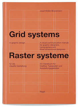 ReadingTypography Grid Systems. Learn how to use a systematic approach to organize your layouts and keep your elements aligned. BUY THIS BOOK >>
TO LEARN EVEN MORE(OR ANOTHER SIMILAR)
Article
Designers Are Remaking the Portfolio Into a Client Magnet Secret Weapon
Check out the book Portfolios for Interior Designers by Maureen Mitton. The title is misleading as it's a relevant and valuable reference for all designers. The book provides short tutorials in Photoshop, Illustrator, and InDesign as well as covering resumes, and presentation and portfolio layout.
VIDEO GUIDES & TUTORIALS
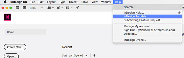
Get familiar with Adobe's Tutorials. They're excellent.
InDesign Help Menu / Tutorials
Other Resources
Lynda.com is available for free to all students via your Single Sign-on account. Look under the Design menu
GETTING STARTED
In InDesign, begin by setting up a 36 page book with facing pages. We will revisit and develop this book file regularly throughout the semester.
See this start guide—
SETTING UP A BRAND STANDARDS GUIDELINE BOOK
DELIVERABLES
First Presentation of Student's client
Digital (PDF) submission due to Dropbox.com prior to start of class.
Submit a PDF of your layout to your folder in the class folder on Dropbox.com (not Beachboard's dropbox).
USE THIS GUIDE TO SET PROPER VIEWING OF YOUR PDF FOR ONLINE DELIVERY FOR YOUR READER
Filenaming. Name your file according to the filenaming standard indicated on the Syllabus, Section 10.5.
You may be asked to submit a printed copy with your presentation, viewed on video display
Verbal Presentation. 2 min presentation, followed by brief, 2 min response per student.
- Identify your client's needs.
- What the business does, range of services, reach of customers, etc. and
- Include company history, color usages, applications to various collateral, etc
- Consider, what are some/all of the elements this business would benefit from design services, such as:
- Product and/or Product Packaging, Retail Displays, etc << PRODUCT
- New signage. << ENVIRONMENTAL DESIGNERS (BAs?)
- New Interior design updates or complete remodel << INTERIORS
- New print collateral, advertising in print, web, bus-backs, metro (bus/rail) stops, << ONLY FOR GRAPHIC DESIGN MAJORS >>
- others?
Your FINAL deliverable will eventually be a hard copy printed saddle-stitch style book, finished. See the instructions for saving your PDF for correct Booklet printing here after your layout is complete.
Your book must contain the following:
- Your Brand Guideline's name,
- Your Name & Contact info on the back cover (how would someone contact you if they wanted to hire you?) YOU MAY USE "DUMMY" CONTACT INFO,
- Table of Contents,
- Automatic Page Numbering, and
- Minimum of three hierarchies of text throughout including:
- titles (largest, graphic in style),
- headings (large, approx. 12pt bold, may be larger),
- body copy descriptions (9 or 10pt type), and
- captions,
- footers, and
- page numbering (7pt).
TUTORIALS & HOW-TO GUIDES
SOME REAL WORLD EXAMPLES
Often Branding Standards can be found on corporate and institutional websites under their marketing section. Usually it takes some hunting and word-play searches to locate them.
For this Semester Let's use MINI (the car company) as a reference for our Case Study process.
Branding Case Study, MINIVisuals Mini Retail Standards 2013+ [PDF]Visuals BMW Retail Standards 2013+ [PDF]BMW Advertising Guidelines August 2017 [PDF]MINI CI Guidelines [PDF] (contains Logo do's & don'ts) Note: These were all found recently using a google search of "mini dealership architecture brand standards guidelines". Different search engines may provide different results. Often we can find Brand Identity Guidelines through corporate websites, with a little creative digging.
Industrial Design
- The Secret of Apple Design. Turner, Daniel. MIT Technology Review.
May 1, 2007
"...Jobs searched for a sympathetic design partner; he finally found one in Hartmut Esslinger of Frog Design. Together, the two companies developed the “Snow White” design language that was meant to give Apple’s products a coherent visual vocabulary, the appearance of being related.
That vocabulary featured, among other things, lines two millimeters wide and deep, spaced 10 millimeters apart, to suggest precision. (Some of the grooves were functional, acting as vents for airflow.) Case corners were rounded, but to differing degrees: if the curve at the back of a computer had a three-millimeter radius, the one at the front had a two-millimeter radius, reducing the machine’s perceived size. In addition, the rounded corners and lines echoed distinctive features of the Mac user interface of the time: rounded screen corners and horizontal lines in the grab bars of windows.
Such precise design requirements simply couldn’t be met by the manufacturing processes used to make most consumer objects–and certainly computers–at the time. Most manufacturers cheat when making plastic cases: they use molds with sloping sides called “drafts,” which let parts pop out more easily and make for simpler, cheaper production."
Urban/Masterplanning Examples
- Huntington Beach Downtown Specific Plan, website
- Huntington Beach Downtown Specific Plan No5 - Book 2: Design Guidelines, Strategies and Implementation [PDF]
Graphic Design Examples
- Bronx Children's Museum [PDF]
- Discovery Children's Museum Brand Standards Guide [PDF]
- FSC [PDF]
- GWU Standards [PDF]
- IEEE Mark Guidelines [PDF]
- IEEE Visual Identity Guidelines [PDF]
- Mohawk Windpower Logomark Guidelines [PDF]
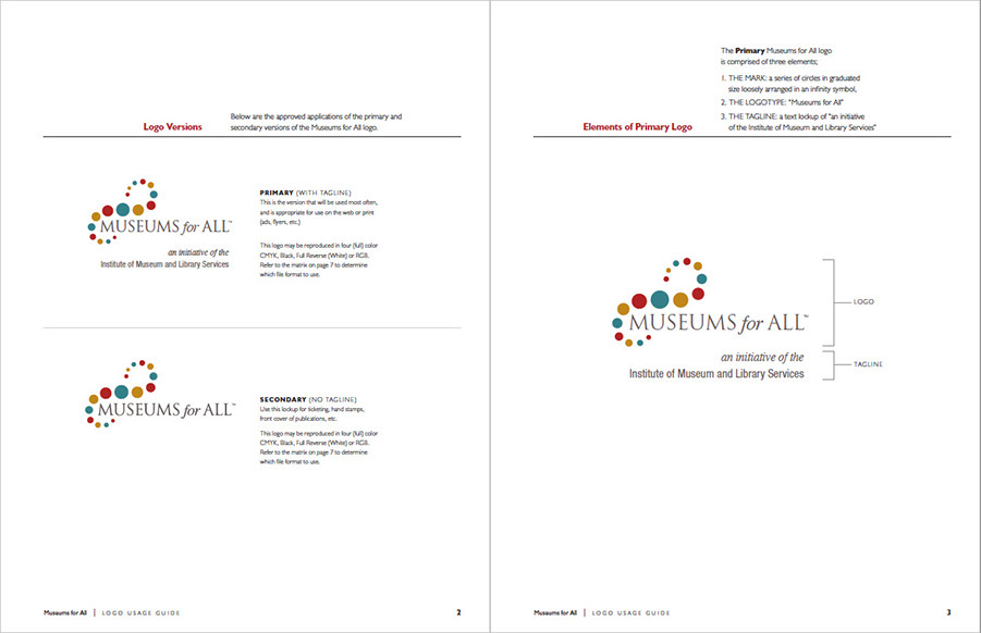
- Museums for All Logo Usage Guide [PDF]
- Nevada Museum of Art [video] <<< WATCH THIS <<<
- Brad Bartlett, Art Center, Transmedia Design, with Aaron Koblin, media artist, and
Dan Goods, visual strategist
- Nielsen Identity Guidelines [PDF]
- NYBlood Center [PDF]
- NYU Website Style Guide [PDF]
- Smithsonian Institute Brand Guide [PDF]
- UC (Cincinnati) Branding Standards [PDF]
Online References
- CSULB Brand Central
- StandardsManual.com
- NASA Standards Manual << AMAZING!! Examples of Cars and Plane applications as well!
- Microsoft Mixed Reality (aka Hololens)
- Google Glass Development
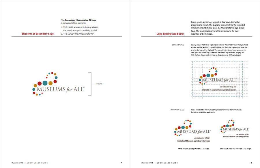
Museums for All Logo Versions and Elements of Primary Logo from Museums for All Logo Usage Guide PDF
Museums for All Elements of Secondary Logo and Logo Spacing and Sizing
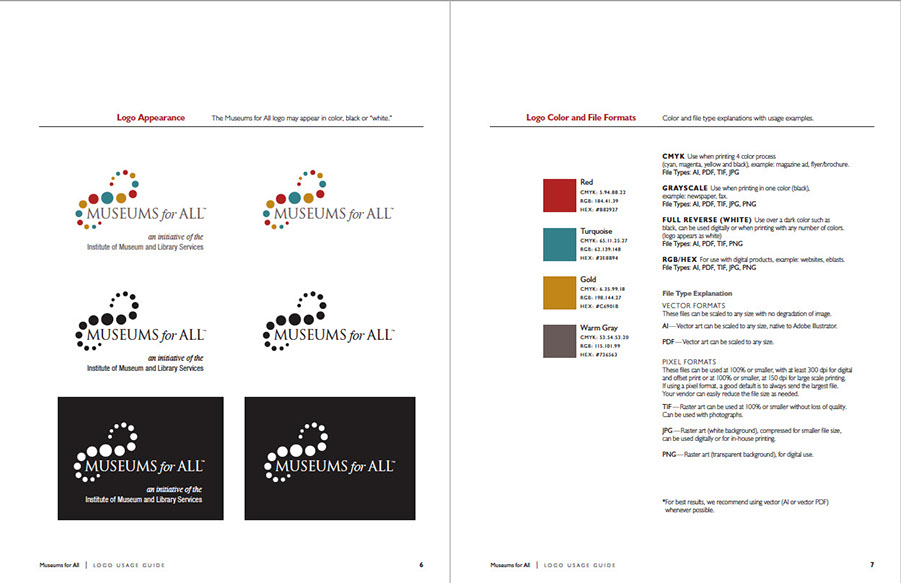
Museums for All Logo Appearance, Color and File Formats
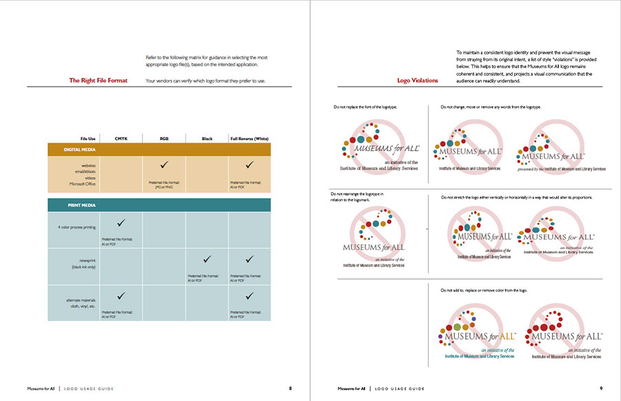
Museums for All Correct File Formats and Logo Violations
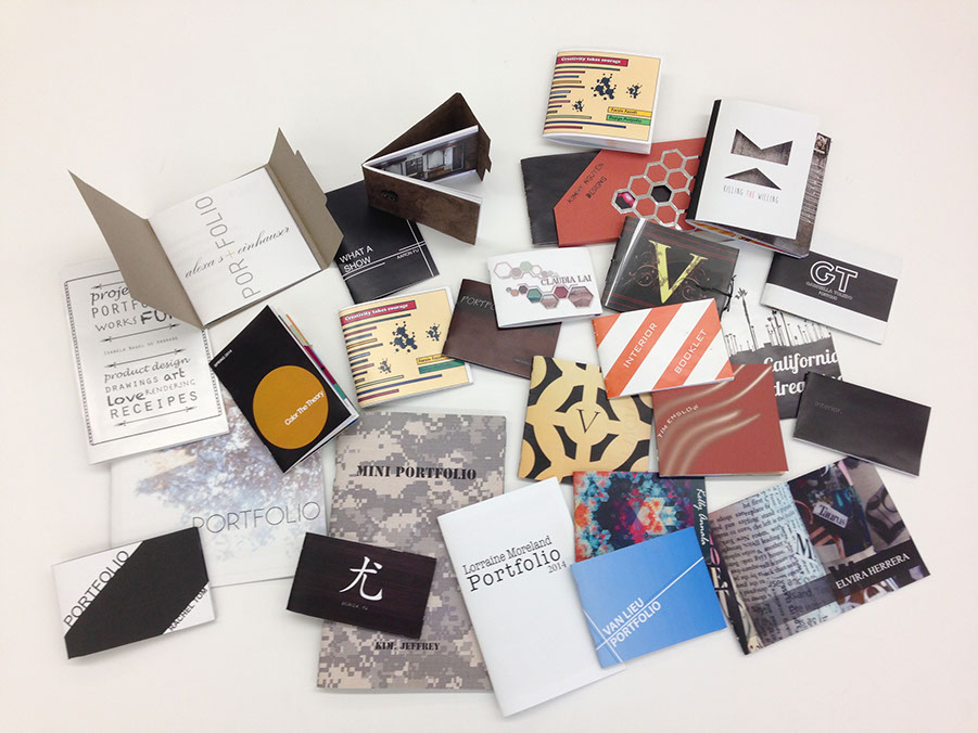
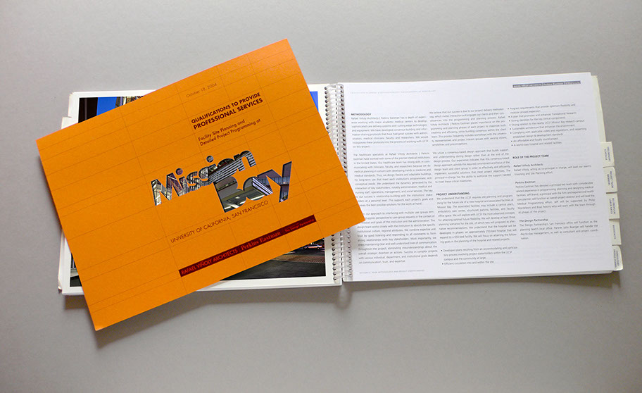
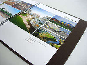
STUDENT PORTFOLIO END-PRODUCT EXAMPLES
GO BEYOND THE BASIC LAYOUT
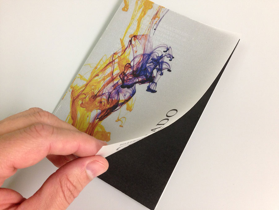
Seek out opportunities to make your book special. The size and format is one aspect, but customized materials used strategically can take it to another level. Consider using a special stock on the cover or work in a fold-out spread. These can be very tricky and in some cases will require a separate file to later be synchronized in final production. While adding complexity may seem intimidating, your final piece will be far more unique and richer
in value as a result of your added effort.
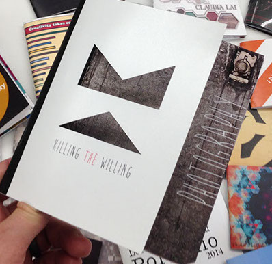
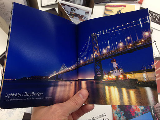
This student hand cut a "window" on the cover, known as a die-cut. The book showcases his professional photography, so he made sure to leverage his images with large editorial style spreads.
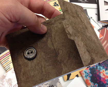
This student added a textured custom paper with a tabbed fold-over cover, creating a tactile experience.
The inside spreads are minimally treated so as to keep the viewer engaged with her work.
This student used a UV Velum on the cover. In this style of book, the cover layer folds
over to the back.
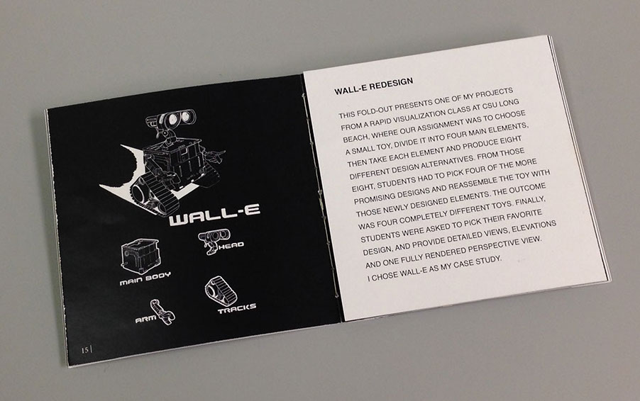
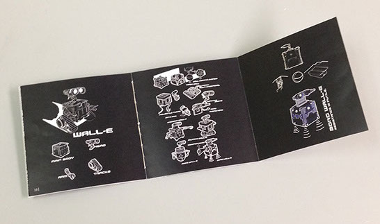
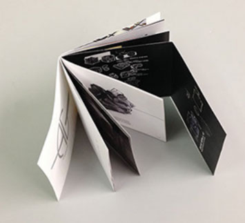
This piece by Amin Ghassemi features a foldout spread in the center of the book. He also used a classic threaded stitching rather than the faster modern staple stitch. A subtle and value-added detail that is truly felt by the recipient or reader.
PROFESSIONAL EXAMPLES, OTHER APPLICATIONS AND FORMATS
Be creative with your finished product!
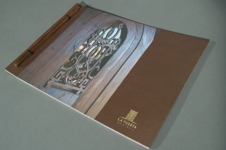
This professional piece produced for a company that specializes in selling rare, unique antique doors is bound using two pieces of rustic wood on both the front and back sides. Remember to think about your work from front to back, inside and out.
For the professional proposal below, we used our laser cutter in combination with laser printing to create a custom, short-run die-cut window for the cover. Simpler geometric cut-outs can be done by hand with an x-acto knife.
We will NOT use any plastic spiral binding. We will be using a saddle-stitched (stapled) method. This method of binding is very economical as it uses just 9 sheets of paper to produce a 36 page layout.

Although this example uses a wire binding, it's shown here as an example of using velum inserts to describe the proposed phasing development.
This book included custom printed and fabricated slip covers and jackets
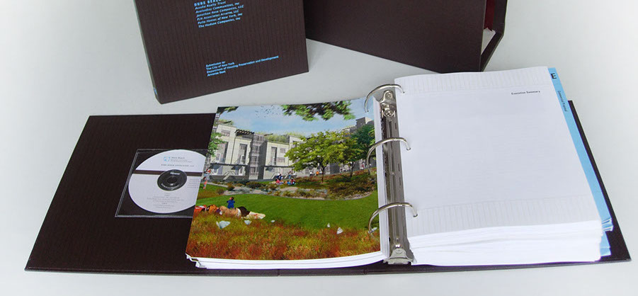
On a binder project like this, you may need to allocate even more space to the GUTTER margin, ie. the inside margin on your spread.
STUDENT LEARNING OBJECTIVES (SLOs)
- Ability to use InDesign to layout, compose, and manage multiple projects in one narrative.
- Students will gain saturated exposure to some of InDesign's most fundamental layout tools.
- Students will gain knowledge of multi-page layout, desktop publishing.
- Students will be able to effectively organize their work into a cohesive portfolio.
- Students will gain an understanding of InDesign as a project management tool.
GRADING AND EVALUATION RUBRIC
The following Rubric will apply in assessment of the student's work product, presentation, and/or process:

EVALUATION RUBRICS
points2020202020criteriaAdherence to project instructionsFormat & Structure of Document (shows process)Content/ResearchAbility to satisfy requirements of BriefAdherence to Design Conventions
^
* Estimate only. See instructor and calendar for specific due dates. Summer Session schedule is more compressed with one week equal to approximately two and half semester weeks.
CSULB | COTA | DEPARTMENT OF DESIGN | BIO

Questions, feedback, suggestions?
Email me with your recommendations.
©2020 Michael LaForte / Studio LaForte, All Rights Reserved. This site and all work shown here is purely for educational purposes only. Where ever possible student work has been used or original works by Michael LaForte.
Works by professionals found online or in publication are used as instructional aids in student understanding and growth and is credited everywhere possible.