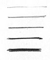
LAYOUT LINE. Thin/light, should almost disappear.
OBJECT DEFINITION. Medium thin/light
PARTING / SEPARATION.
PROFILE / BOUNDARY / UNDERCUTS.
BASE / SHADOW.
LINE WEIGHTS AND USAGE
When we draw we are conscious of how we make a line and what that line means, or expresses. While there are always exceptions, the following rules will generally prove to help your drawings pop and feel dynamic. Drawings
that fail to exhibit a variety of line development, will almost always feel flat and cold, and worse, may fail to clearly express the form you are trying to convey.
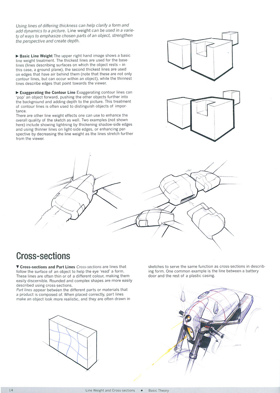
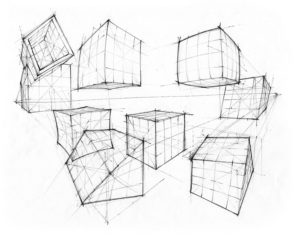
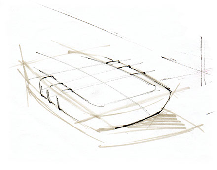
BASIC LINE WEIGHT. The upper right hand image shows a basic line weight treatment. The thickest lines are used for the base lines (lines describing surfaces on which the object rests — in this case, a ground plane), the second thickest lines are used on edges that have air behind or under them (note that these are not only contour lines, but can occur within the object), while the thinnest lines describe edges that point towards the viewer, aka leading edges.
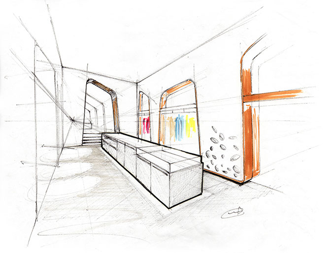
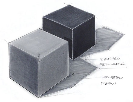
EXAGGERATING PERIMETER. These can make the drawing 'POP' an object forward, setting it off from other objects in the scene, as was done on the display case in the boutique sketch below.
TUTORIALS & HOW-TO GUIDES
by Spencer Nugent, Sketch-a-Dy
ATMOSPHERIC PERSPECTIVE. Allowing line to thin out, gets lighter, or fade off creates a sense of depth and distance from the viewer.
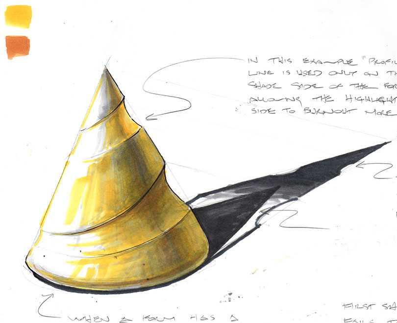
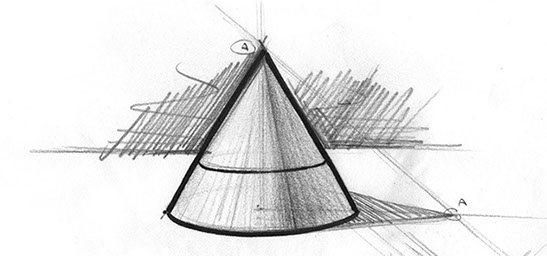
LIGHTING EFFECTS. Use a thinner line on the side where the light is coming from "burning out" the line in the light, while using a stronger line on the shade side of the form.
In this example the "profile" line is used only on the SHADE side and UNDER CUT edges of the form, allowing the highlight or glare side of to BURNOUT more dramatically.
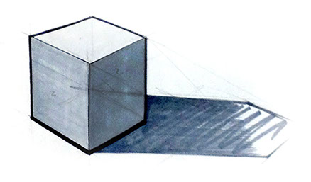
Notice there are two shadows expressed here. Notice the short one does
not accurately describe the cutouts on the form, while
the long shadow, while not technically perfect, helps to describe the form more.
Feel free to "fade out", and blur the edges more the longer the shadow is from
the form.
Notice the increased rounding at the base. When a form has a rounded base, the shadow "leaks" out around the base slightly. It's common to see this on things like sports bottles.
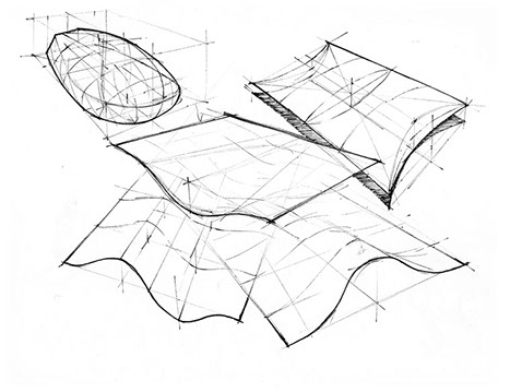
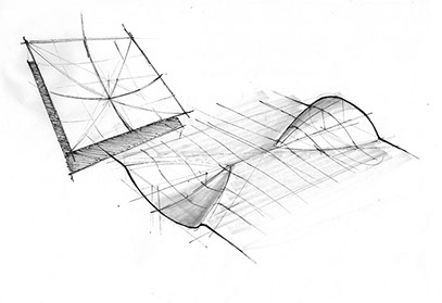
CROSS-SECTIONS and CONTOURS are lines that follow the surface of an object to help the designer better understand the form. It also helps communicate to others about the form surface. They should be very thin and light, and can even be expressed in a different color.
PARTING LINES appear where two parts or materials come together. These can be very thin,
or much thicker to express a deeper gap between
the parts. When rendering,
it helps to think of the line
as the shadow. Add more character by adding a highlight below the parting line, or away from the
light direction.
HIGHLIGHT LEADING EDGES. If you plan to render your forms, a good trick is to render early, before you ink your edges. Then as you're rendering, back off and don't render all the way to each edge, leaving just a sliver of white paper to come through. Use a kneaded eraser to remove any graphite that may be there and the edge will suddenly pop! If you lose it, no big deal, just put it back in with white pencil for a soft highlight, or use your gouache paint for a stronger pop.
* Estimate only. See instructor and calendar for specific due dates. Summer Session schedule is more compressed with one week equal to approximately two and half semester weeks.
CSULB | COTA | DEPARTMENT OF DESIGN | BIO

Questions, feedback, suggestions?
Email me with your recommendations.
©2020 Michael LaForte / Studio LaForte, All Rights Reserved. This site and all work shown here is purely for educational purposes only. Where ever possible student work has been used or original works by Michael LaForte.
Works by professionals found online or in publication are used as instructional aids in student understanding and growth and is credited everywhere possible.